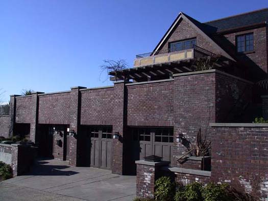
Renovation of Classic Tudor into a 6,000-SF High-Tech Home
Winner of Seattle Homes and Lifestyles magazine 2003 Home of the Year
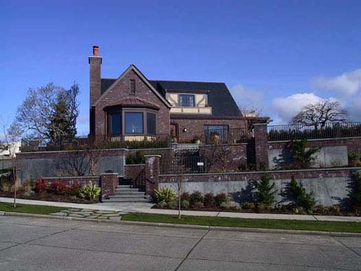
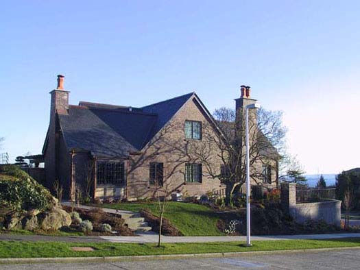
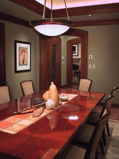
This project is deceptive. At first glance, it seems a typical Seattle brick Tudor, vintage 1927. Inside, after three years of design and construction, it’s a fully renovated 6,000-sf high-tech home. Above all, it’s the result of intense collaboration between owners and design team to discover and express the owners’ vision of where they want to live the rest of their lives.
What the Client Asked For
- Renovate an existing brick Tudor house without disrupting its scale and the way it fits into the neighborhood.
- Define a clear organization of space and circulation, creating inviting spaces for guests, yet maintaining areas for private retreat.
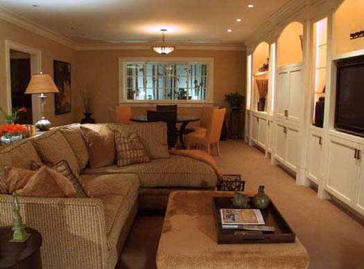
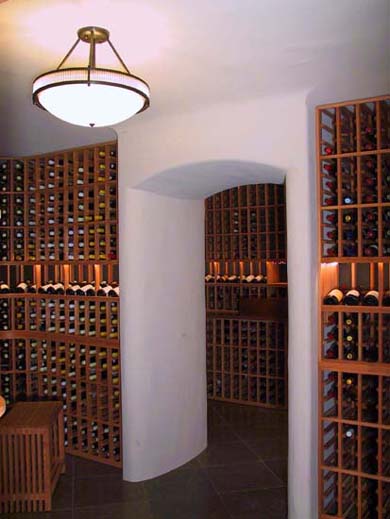
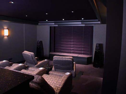
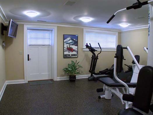
- Expand space to accommodate a family room, office, home theater, wine cellar, exercise room, and laundry room.
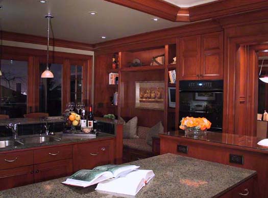
- Expand and upgrade the kitchen to a professional level.
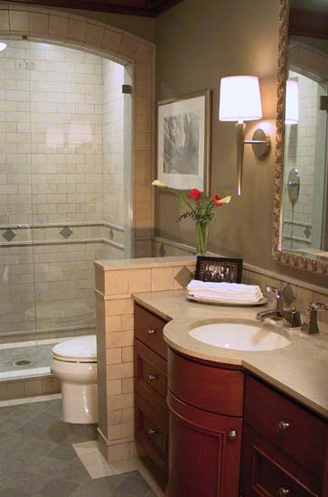
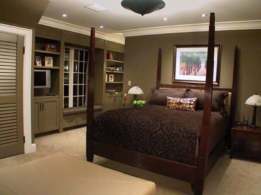
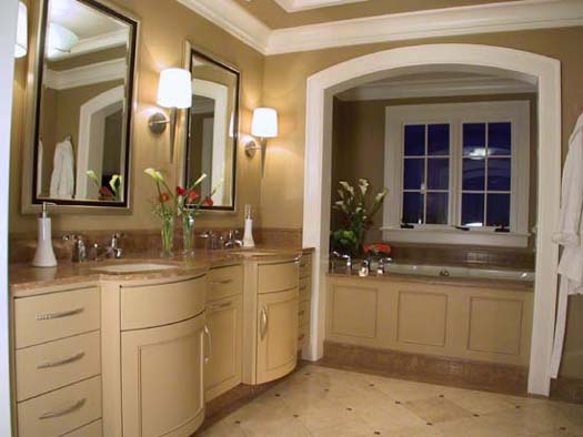
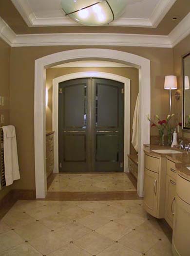
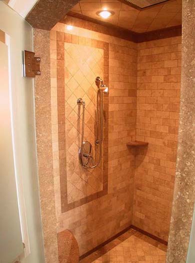
- Expand master suite to include large tub with window view, sinks and vanities, and separate shower and toilet areas.
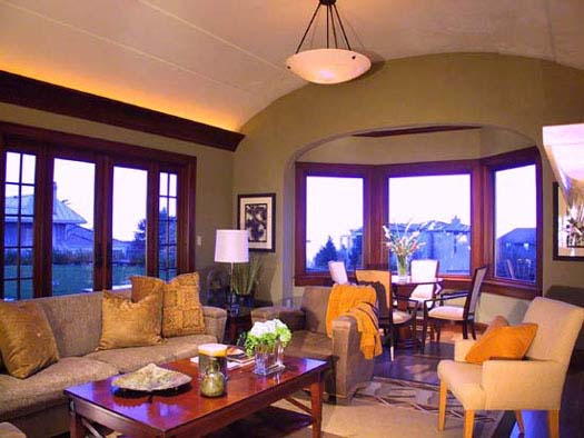
- Take full advantage of views of the Olympics, Cascades, and Downtown.
- Incorporate the highest-quality materials and high-tech systems for beauty, comfort, long-term durability, and minimum maintenance.
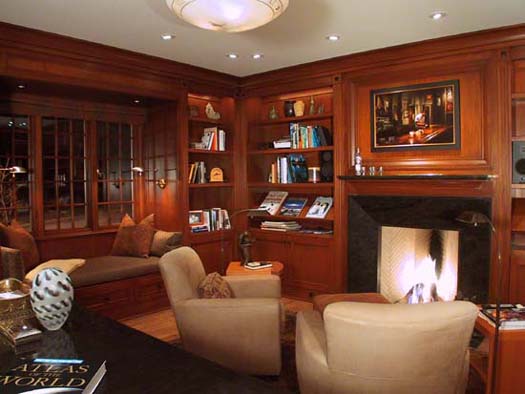
- Create a totally integrated environment, including lighting, finishes, furnishings, fixtures, and artwork.
Solutions
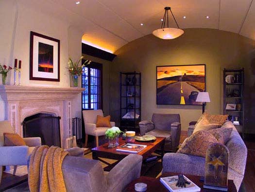
The design process has harmonized opposites, with balance between openness and privacy, grandeur and human scale, classical space and Northwest informality, sumptuous materials and simple practicality, high technology and respectful reinterpretation of the art-deco-influenced traditional interior.
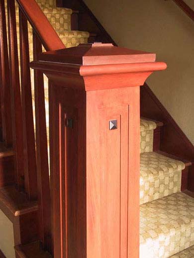
This vision encompasses every element, from the large scale, such as floor plans and the definition of views, down to details, such as a newel or faucet handle. Some examples:
- To respect neighborhood scale above grade, the basement was expanded for additional rooms.
- Interior walls were repositioned, refining the 1920s layout with clear axes for views and circulation, creating a sequence of events as you move through the space.
- An art-deco corbel pattern — implemented through painstaking, custom craftsmanship — appears in the front door, repeated ceiling barrel vaults, mahogany casework, railing newel posts, and elsewhere, to develop thematic unity.
The space invites discovery: anticipation and fulfillment, symmetry and asymmetry. Each part mirrors and supports the organizing principles of the whole. Like a multifaceted jewel, this home reflects completely the values and taste of the family who lives here.
Design and Construction Team
CASA Architecture – Interior Design would like to acknowledge the significant contribution of the owners and other members of the design and construction team: Carl Williams Interiors, Shapiro-Ryan Design (landscape), Lightcrafters, and Prestige Custom Builders.
